Category: Structured Journalism
Structured Journalism
Researchers mine Fact-Check Insights data to explore many facets of misinfo
The dataset from the Duke Reporters’ Lab has been downloaded hundreds of times
By Erica Ryan - June 20, 2024
Researchers around the world are digging into the trove of data available from our Fact-Check Insights project, with plans to use it for everything from benchmarking the performance of large language models to studying the moderation of humor online.
Since launching in December, the Fact-Check Insights dataset has been downloaded more than 300 times. The dataset is updated daily and made available at no cost to researchers by the Duke Reporters’ Lab, with support from the Google News Initiative.
Fact-Check Insights contains structured data from more than 240,000 claims made by political figures and social media accounts that have been analyzed and rated by independent fact-checkers. The dataset is powered by ClaimReview and MediaReview, twin tagging systems that allow fact-checkers to enter standardized data about their fact-checks, such as the statement being checked, the speaker, the date, and the rating.
Users have found great value in the data.
Marcin Sawiński, a researcher in the Department of Information Systems at the Poznań University of Economics and Business in Poland, is part of a team using ClaimReview data for a multiyear project aimed at developing a tool to assess the credibility of online sources and detect false information using AI.
“With nearly a quarter of a million items reviewed by hundreds of fact-checking organizations worldwide, we gain instant access to a vast portion of the fact-checking output from the past several years,” Sawiński writes. “Manually tracking such a large number of fact-checking websites and performing web data extraction would be prohibitively labor-intensive. The ready-made dataset enables us to conduct comprehensive cross-lingual and cross-regional analyses of fake-news narratives with much less effort.”
The OpenFact project, which is financed by the National Center for Research and Development in Poland, uses natural language processing and machine learning techniques to focus on specific topics.
“Shifting our efforts from direct web data extraction to the cleanup, disambiguation, and harmonization of ClaimReview data has significantly reduced our workload and increased our reach,” Sawiński writes.
Other researchers who have downloaded the dataset plan to use it for benchmarking the performance of large language models for fact-checking uses. Others are investigating the response to false information by social media platforms.
Ariadna Matamoros-Fernández, a senior lecturer in digital media in the School of Communication at Queensland University of Technology in Australia, plans to use the Fact-Check Insights dataset as part of her research into identifying and moderating humor on digital platforms.
“I am using the dataset to find concrete examples of humorous posts that have been fact-checked to discuss these examples in interviews with factcheckers,” Matamoros-Fernández writes. “I am also using the dataset to use examples of posts that have been flagged as being satire, memes, humour, parody etc to test whether different foundation models (GPT4/Gemini) are good at assessing these posts.”
The goals of her research include trying to “better understand the dynamics of harmful humour online” and creating best practices to tackle them. She has received a Discovery Early Career Researcher Award from the Australian Research Council to support her work.
Rafael Aparecido Martins Frade, a doctoral student working with the Spanish fact-checking organization Newtral, plans to utilize the data in his research on using AI to tackle disinformation.
“I am currently researching automated fact-checking, namely multi-modal claim matching,” he writes of his work. “The objective is to develop models and mechanisms to help fight the spread of fake news. Some of the applications we’re planning to work on are euroscepticism, climate emergency and health.”
Researchers who have downloaded the Fact-Check Insights dataset have also provided the Reporters’ Lab with feedback on making the data more usable.
Enrico Zuccolotto, a master’s degree student in artificial intelligence at the Polytechnic University of Milan, performed a thorough review of the dataset, offering suggestions aimed at reducing duplication and filling in missing data.
While the data available from Fact-Check Insights is primarily presented in the original form submitted by fact-checking organizations, the Reporters’ Lab has made small attempts to enhance the data’s clarity, and we will continue to make such adjustments where feasible.
Researchers who have questions about the dataset can refer to the “Guide to the Data” page, which includes a table outlining the fields included, along with examples (see the “What you can expect when you download the data” section). The Fact-Check Insights dataset is available for download in JSON and CSV formats.
Access is free for researchers, journalists, technologists and others in the field, but registration is required.
Related: What exactly is the Fact-Check Insights dataset?
What exactly is the Fact-Check Insights dataset?
Get details about data that can aid your misinformation research
By Erica Ryan - June 20, 2024
Since its launch in December, the Fact-Check Insights dataset has been downloaded hundreds of times by researchers who are studying misinformation and developing technologies to boost fact-checking.
But what should you expect if you want to use the dataset for your work?
First, you will need to register. The Duke Reporters’ Lab, which maintains the dataset with support from the Google News Initiative, generally approves applications within a week. The dataset is intended for academics, researchers, journalists and/or fact-checkers.
Once you are approved, you will be able to download the dataset in either CSV or JSON format.
Those files include the metadata for more than 200,000 fact-checks that have been tagged with ClaimReview and/or MediaReview markup.
The two tagging systems — ClaimReview for text-based claims, MediaReview for images and videos — are used by fact-checking organizations across the globe. ClaimReview summarizes a fact-check, noting the person and claim being checked and a conclusion about its accuracy. MediaReview allows fact-checkers to share their assessment of whether a given image, video, meme or other piece of media has been manipulated.
The Reporters’ Lab collects ClaimReview and MediaReview data when it is submitted by fact-checkers. We filter the data to include only reputable fact-checking organizations that have qualified to be listed in our database, which we have been publishing and updating for a decade. We also work to reduce duplicate entries, and standardize the names of fact-checking organizations. However, for the most part, the data is presented in its original form as submitted by fact-checking organizations.
Here are the fields that you can expect to be included in the dataset, along with examples:
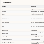
ClaimReview
| CSV Key | Description | Example Value |
|---|---|---|
| id | Unique ID for each ClaimReview entry | 6c4f3a30-2ec1-4e2e-9b57-41ad876223e5 |
| @context | Link to schema.org, the home of ClaimReview | https://schema.org |
| @type | Type of schema being used | ClaimReview |
| claimReviewed | The claim/statement that was assessed by the fact-checker | Marsha Blackburn “voted against the Reauthorization of the Violence Against Women Act, which attempts to protect women from domestic violence, stalking, and date rape.” |
| datePublished | The date the fact-check article was published | 10/9/18 |
| url | The URL of the fact-check article | https://www.politifact.com/truth-o-meter/statements/2018/oct/09/taylor-swift/taylor-swift-marsha-blackburn-voted-against-reauth/ |
| author.@type | Type of author | Organization |
| author.name | The name of the fact-checking organization that submitted the fact-check | PolitiFact |
| author.url | The main URL of the fact-checking organization | http://www.politifact.com |
| itemReviewed.@type | Type of item reviewed | Claim |
| itemReviewed.author.name | The person or group that made the claim that was assessed by the fact-checker | Taylor Swift |
| itemReviewed.author.@type | Type of speaker | Person |
| itemReviewed.author.sameAs | URLs that help establish the identity of the person or group that made the claim, such as a Wikipedia page (rarely used) | https://www.taylorswift.com/ |
| reviewRating.@type | Type of review | Rating |
| reviewRating.ratingValue | An optional numerical value assigned to a fact-checker’s rating. Not standardized. (Note: 1.) The ClaimReview schema specifies the use of an integer for the ratingValue, worstRating and bestRating fields. 2.) For organziations that use ratings scales (such as PolitiFact), if the rating chosen falls on the scale, the numerical rating will appear in the ratingValue field. 3.) If the rating isn’t on the scale (ratings that use custom text, or special categories like Flip Flops), the ratingValue field will be empty, but worstRating and bestRating will still appear. 4.) For organizations that don’t use ratings that fall on a numerical scale, all three fields will be blank.) |
8 |
| reviewRating.alternateName | The fact-checker’s conclusion about the accuracy of the claim in text form — either a rating, like “Half True,” or a short summary, like “No evidence” | Mostly True |
| author.image | The logo of the fact-checking organization | https://d10r9aj6omusou.cloudfront.net/factstream-logo-image-61554e34-b525-4723-b7ae-d1860eaa2296.png |
| itemReviewed.name | The location where the claim was made | in an Instagram post |
| itemReviewed.datePublished | The date the claim was made | 10/7/18 |
| itemReviewed.firstAppearance.url | The URL of the first known appearance of the claim | https://www.instagram.com/p/BopoXpYnCes/?hl=en |
| itemReviewed.firstAppearance.type | Type of content being referenced | Creative Work |
| itemReviewed.author.image | An image of the person or group that made the claim | https://static.politifact.com/CACHE/images/politifact/mugs/taylor_swift_mug/03dfe1b483ec8a57b6fe18297ce7f9fd.jpg |
| reviewRating.ratingExplanation | One to two short sentences providing context and information that led to the fact-checker’s conclusion | Blackburn voted in favor of a Republican alternative that lacked discrimination protections based on sexual orientation and gender identity. But Blackburn did vote no on the final version that became law. |
| itemReviewed.author.jobTitle | A title or description of the person or group that made the claim | Mega pop star |
| reviewRating.bestRating | An optional numerical value representing what rating a fact-checker would assign to the most accurate content it assesses. See note on “reviewRating.ratingValue” field above. | 10 |
| reviewRating.worstRating | An optional numerical value representing what rating a fact-checker would assign to the least accurate content it assesses. See note on “reviewRating.ratingValue” field above. | 0 |
| reviewRating.image | An image representing the fact-checker’s rating, such as the Truth-O-Meter | https://static.politifact.com/politifact/rulings/meter-mostly-true.jpg |
| itemReviewed.appearance.1.url to itemReviewed.appearance.15.url | A URL where the claim appeared. This field has been limited to the first 15 URLs submitted for the stability of the CSV. See the JSON download for complete “appearance” data. | https://www.instagram.com/p/BopoXpYnCes/?hl=en |
| itemReviewed.appearance.1.@type to itemReviewed.appearance.15.@type | Type of content being referenced | CreativeWork |
MediaReview
| CSV Key | Description | Example Value |
|---|---|---|
| id | Unique ID for each MediaReview entry | 2bfe531d-ff53-40f5-8114-a819db22ca8b |
| @context | Link to schema.org, the home of MediaReview | https://schema.org |
| @type | Type of schema being used | MediaReview |
| datePublished | The date the fact-check article was published | 2020-07-02 |
| mediaAuthenticityCategory | The fact-checker’s conclusion about whether the media was manipulated, ranging from “Original” to “Transformed” (More detail) | Transformed |
| originalMediaContextDescription | A short sentence explaining the original context if media is used out of context | In this case, there was no original context. But this is a text field. |
| originalMediaLink | Link to the original, non-manipulated version of the media (if available) | https://example.com/ |
| url | The URL of the fact-check article that assesses a piece of media | https://www.politifact.com/factchecks/2020/jul/02/facebook-posts/no-taylor-swift-didnt-say-we-should-remove-statue-/ |
| author.@type | Type of author | Organization |
| author.name | The name of the fact-checking organization | PolitiFact |
| author.url | The URL of the fact-checking organization | http://www.politifact.com |
| itemReviewed.contentUrl | The URL of the post containing the media that was fact-checked | https://www.facebook.com/photo.php?fbid=10223714143346243&set=a.3020234149519&type=3&theater |
| itemReviewed.startTime | Timestamp of video edit (in HH:MM:SS format) | 0:01:00 |
| itemReviewed.endTime | Ending timestamp of video edit, if applicable (in HH:MM:SS format) | 0:02:00 |
| itemReviewed.@type | Type of media being reviewed | ImageObject / VideoObject / AudioObject |
Please note that not every fact-check will contain data for every field.
For the JSON version of the table above, please see the “What you can expect when you download the data” section of the Guide on the Fact-Check Insights website. The Guide page also contains tips for working with the ClaimReview and MediaReview data.
If you continue to have questions about the Fact-Check Insights dataset, please reach out to hello@factcheckinsights.org.
Related: Researchers mine Fact-Check Insights data to explore many facets of misinfo
MediaReview: A next step in solving the misinformation crisis

An update on what we’ve learned from 1,156 entries of MediaReview, our latest collaboration to combat misinformation.
By - June 2, 2022
When a 2019 video went viral after being edited to make House Speaker Nancy Pelosi look inebriated, it took 32 hours for one of Facebook’s independent fact-checking partners to rate the clip false. By then, the video had amassed 2.2 million views, 45,000 shares, and 23,000 comments – many of them calling her “drunk” or “a babbling mess.”
The year before, the Trump White House circulated a video that was edited to make CNN’s Jim Acosta appear to aggressively react to a mic-wielding intern during a presidential press conference.
A string of high-profile misleading videos like these in the run-up to the 2020 U.S. election stoked long-feared concerns about skillfully manipulated videos, sometimes using AI. The main worry then was how fast these doctored videos would become the next battleground in a global war against misinformation. But new research by the Duke Reporters’ Lab and a group of participating fact-checking organizations in 22 countries found that other, far less sophisticated forms of media manipulation were much more prevalent.
By using a unified tagging system called MediaReview, the Reporters’ Lab and 43 fact-checking partners collected and categorized more than 1,000 fact-checks based on manipulated media content. Those accumulated fact-checks revealed that:
- While we began this process in 2019 expecting deepfakes and other sophisticated media manipulation tactics to be the most imminent threat, we’ve predominantly seen low-budget “cheap fakes.” The vast majority of media-based misinformation is rated “Missing Context,” or, as we’ve defined it, “presenting unaltered media in an inaccurate manner.” In total, fact-checkers have applied the Missing Context rating to 56% of the MediaReview entries they’ve created.
- Most of the fact-checks in our dataset, 78%, come from content on Meta’s platforms Facebook and Instagram, likely driven by the company’s well-funded Third-Party Fact Checking-Program. These platforms are also more likely to label or remove fact-checked content. More than 80% of fact-checked posts on Instagram and Facebook are either labeled to add context or no longer on the platform. In contrast, more than 60% of fact-checked posts on YouTube and Twitter remain intact, without labeling to indicate their accuracy.
- Without reliable tools for archiving manipulated material that is removed or deleted, it is challenging for fact-checkers to track trends and bad actors. Fact-checkers used a variety of tools, such as the Internet Archive’s Wayback Machine, to attempt to capture this ephemeral misinformation; but only 67% of submitted archive links were viewable on the chosen archive when accessed at a later date, while 33% were not.
The Reporters’ Lab research also demonstrated MediaReview’s potential — especially based on the willingness and enthusiastic participation of the fact-checking community. With the right incentives for participating fact-checkers, MediaReview provides efficient new ways to help intercept manipulated media content — in large part because so many variations of the same claims appear repeatedly around the world, as the pandemic has continuously demonstrated.
The Reporters’ Lab began developing the MediaReview tagging system around the time of the Pelosi video, when Google and Facebook separately asked the Duke team to explore possible tools to fight the looming media misinformation crisis.
MediaReview is a sibling to ClaimReview, an initiative the Reporters’ Lab led starting in 2015, that sought to create infrastructure for fact-checkers to make their articles machine-readable and easily used for search engines, mobile apps, and other projects. Called “one of the most successful ‘structured journalism’ projects ever launched,” the ClaimReview schema has proven immensely valuable. Used by 177 fact-checking organizations around the world, ClaimReview has been used to tag 136,744 articles, establishing a large and valuable corpus of fact-checks: tens of thousands of statements from politicians and social media accounts around the world analyzed and rated by independent journalists.
But ClaimReview proved insufficient to address the new, specific challenges presented by misinformation spread through multimedia. Thus, in September 2019, the Duke Reporters’ Lab began working with the major search engines, social media services, fact-checkers and other interested stakeholders on an open process to develop MediaReview, a new sibling of ClaimReview that creates a standard for manipulated video and images. Throughout pre-launch testing phases, 43 fact-checking outlets have used MediaReview to tag 1,156 images and videos, again providing valuable, structured information about whether pieces of content are legitimate and how they may have been manipulated.
In an age of misinformation, MediaReview, like ClaimReview before it, offers something vital: real-time data on which pieces of media are truthful and which ones are not, as verified by the world’s fact-checking journalists.
But the work of MediaReview is not done. New fact-checkers must be brought on board in order to reflect the diversity and global reach of the fact-checking community, the major search and social media services must incentivize the creation and proper use of MediaReview, and more of those tech platforms and other researchers need to learn about, and make full use of, the opportunities this new tagging system can provide.
An Open Process
MediaReview is the product of a two-year international effort to get input from the fact-checking community and other stakeholders. It was first adapted from a guide to manipulated video published by The Washington Post, which was initially presented at a Duke Tech & Check meeting in the spring of 2019. The Reporters’ Lab worked with Facebook, Google, YouTube, Schema.org, the International Fact-Checking Network, and The Washington Post to expand this guide to include a similar taxonomy for manipulated images.
The global fact-checking community has been intimately involved in the process of developing MediaReview. Since the beginning of the process, the Reporters’ Lab has shared all working drafts with fact-checkers and has solicited feedback and comments at every step. We and our partners have also presented to the fact-checking community several times, including at the Trusted Media Summit in 2019, a fact-checkers’ community meeting in 2020, Global Fact 7 in 2020, Global Fact 8 in 2021 and several open “office hours” sessions with the sole intent of gathering feedback.
Throughout development and testing, the Reporters’ Lab held extensive technical discussions with Schema.org to properly validate the proposed structure and terminology of MediaReview, and solicited additional feedback from third-party organizations working in similar spaces, including the Partnership on AI, Witness, Meedan and Storyful.
Analysis of the First 1,156
As of February 1, 2022, fact-checkers from 43 outlets spanning 22 countries have now made 1,156 MediaReview entries.

Number of outlets creating MediaReview by country.

Number of MediaReview entries created by outlet.
Our biggest lesson in reviewing these entries: The way misinformation is conveyed most often through multimedia is not what we expected. We began this process in 2019 expecting deepfakes and other sophisticated media manipulation tactics to be an imminent threat, but we’ve predominantly seen low-budget “cheap fakes.” What we’ve seen consistently throughout testing is that the vast majority of media-based misinformation is rated “Missing Context,” or, as we’ve defined it, “presenting unaltered media in an inaccurate manner.” In total, fact-checkers have applied the Missing Context rating to 56% of the MediaReview entries they’ve created.
The “Original” rating has been the second most applied, accounting for 20% of the MediaReview entries created. As we’ve heard from fact-checkers through our open feedback process, a substantial portion of the media being fact-checked is not manipulated at all; rather, it consists of original videos of people making false claims. Going forward, we know we need to be clear about the use of the “Original” rating as we help more fact-checkers get started with MediaReview, and we need to continue to emphasize the use of ClaimReview to counter the false claims contained in these kinds of videos.
Throughout the testing process, the Duke Reporters’ Lab has monitored incoming MediaReview entries and provided feedback to fact-checkers where applicable. We’ve heard from fact-checkers that that feedback was valuable and helped clarify the rating system.
Reviewing media links that have been checked by third-party fact-checkers, a vast majority of fact-checked media thus far exists on Facebook:

Share of links in the MediaReview dataset by platform.
Facebook’s well-funded Third Party Fact-Checking Program likely contributes to this rate; fact-checkers are paid directly to check content on Facebook’s platforms, making that content more prevalent in our dataset.
We also reviewed the current status of links checked by fact-checkers and tagged with MediaReview. With different platforms having different policies on how they deal with misinformation, some of the original posts are intact, others have been removed by either the platform or the user, and some have a context label appended with additional fact-check information. By platform, Instagram is the most likely to append additional information, while YouTube is the most likely to present fact-checked content in its original, intact form, not annotated with any fact-checking information: 72.5% of the media checked from YouTube are still available in their original format on the platform.

Status of fact-checked media broken down by platform, showing the percentage of checked media either labeled with additional context, removed, or presented fully intact.
In addition, we noted that fact-checkers have often (roughly 25% of the time) input an archival link into the “Media URL” field, in an attempt to capture the link for the video or image, ephemeral misinformation that is often quickly deleted by either the platforms or the users. Notably, though, these existing archive systems are unreliable; only 67% of submitted archive links were viewable on the archive, while 33% were not. While we found that Perma.cc was the most reliable existing archiving system used by fact-checkers, it only successfully presented 80% of checked media, and its status as a paid archival tool leaves an opportunity to build a new system to preserve fact-checked media.

Success rate of archival tools used by fact-checkers in properly displaying the fact-checked media.
Next Steps
Putting MediaReview to use: Fact-checkers have emphasized to us the need for social media companies and search engines platforms to make use of these new signals. They’ve highlighted that usability testing would help ensure that MediaReview data was seen prominently on the tech platforms.
Archiving the images and videos: As noted above, current archiving systems are insufficient to capture the media misinformation fact-checkers are reporting on. Currently, fact-checkers using MediaReview are limited to quoting or describing the video or image they checked and including the URL where they discovered it. There’s no easy, consistent workflow for preserving the content itself. Manipulated images and videos are often removed by social media platforms or deleted or altered by their owners, leaving no record of how they were manipulated or presented out of context. In addition, if the same video or image emerges again in the future, it can be difficult to determine if it has been previously fact-checked. A repository of this content — which could be saved automatically as part of each MediaReview submission — would allow for accessibility and long-term durability for archiving, research, and more rapid detection of misleading images and video.
Making more: We continue to believe that fact-checkers need incentives to continue making this data. The more fact-checkers use these schemas, the more we increase our understanding of the patterns and spread of misinformation around the world — and the ability to intercept inaccurate and sometimes dangerous content. The effort required to produce ClaimReview or MediaReview is relatively low, but adds up cumulatively — especially for smaller teams with limited technological resources.
While fact-checkers created the first 1,156 entries solely to help the community refine and test the schema, further use by the fact-checkers must be encouraged by the tech platforms’ willingness to adopt and utilize the data. Currently, 31% of the links in our MediaReview dataset are still fully intact where they were first posted; they have not been removed or had any additional context added. Fact-checkers have displayed their eagerness to research manipulated media, publish detailed articles assessing their veracity, and make their assessments available to the platforms to help curb the tide of misinformation. Search engines and social media companies must now decide to use and display these signals.
Appendix: MediaReview Development Timeline
MediaReview is the product of a two-year international effort involving the Duke Reporters’ Lab, the fact-checking community, the tech platforms and other stakeholders.
Mar 28, 2019
Phoebe Connelly and Nadine Ajaka of The Washington Post first presented their idea for a taxonomy classifying manipulated video at a Duke Tech & Check meeting.
Sep 17, 2019
The Reporters’ Lab met with Facebook, Google, YouTube, Schema.org, the International Fact-Checking Network, and The Washington Post in New York to plan to expand this guide to include a similar taxonomy for manipulated images.
Oct 17, 2019
The Reporters’ Lab emailed a first draft of the new taxonomy to all signatories of the IFCN’s Code of Principles and asked for comments.
Nov 26, 2019
After incorporating suggestions from the first draft document and generating a proposal for Schema.org, we began to test MediaReview for a selection of fact-checks of images and videos. Our internal testing helped refine the draft of the Schema proposal, and we shared an updated version with IFCN signatories on November 26.
Jan 30, 2020
The Duke Reporters’ Lab, IFCN and Google hosted a Fact-Checkers Community Meeting at the offices of The Washington Post. Forty-six people, representing 21 fact-checking outlets and 15 countries, attended. We presented slides about MediaReview, asked fact-checkers to test the creation process on their own, and again asked for feedback from those in attendance.
Apr 16, 2020
The Reporters’ Lab began a testing process with three of the most prominent fact-checkers in the United States: FactCheck.org, PolitiFact, and The Washington Post. We have publicly shared their test MediaReview entries, now totaling 421, throughout the testing process.
Jun 1, 2020
We wrote and circulated a document summarizing the remaining development issues with MediaReview, including new issues we had discovered through our first phase of testing. We also proposed new Media Types for “image macro” and “audio,” and new associated ratings, and circulated those in a document as well. We published links to both of these documents on the Reporters’ Lab site (We want your feedback on the MediaReview tagging system) and published a short explainer detailing the basics of MediaReview (What is MediaReview?)
Jun 23, 2020
We again presented on MediaReview at Global Fact 7 in June 2020, detailing our efforts so far and again asking for feedback on our new proposed media types and ratings and our Feedback and Discussion document. The YouTube video of that session has been viewed over 500 times, by fact-checkers around the globe, and dozens participated in the live chat.
Apr 1, 2021
We hosted another session on MediaReview for IFCN signatories on April 1, 2021, again seeking feedback and updating fact-checkers on our plans to further test the Schema proposal.
Jun 3, 2021
In June 2021, the Reporters’ Lab worked with Google to add MediaReview fields to the Fact Check Markup Tool and expand testing to a global userbase. We regularly monitored MediaReview and maintained regular communication with fact-checkers who were testing the new schema.
Nov 10, 2021
We held an open feedback session with fact-checkers on November 10, 2021, providing the community another chance to refine the schema. Overall, fact-checkers have told us that they’re pleased with the process of creating MediaReview and that its similarity to ClaimReview makes it easy to use. As of February 1, 2022, fact-checkers have made a total of 1,156 MediaReview entries.
For more information about MediaReview, contact Joel Luther.
MediaReview Testing Expands to a Global Userbase

The Duke Reporters’ Lab is launching the next phase of development of MediaReview, a tagging system that fact-checkers can use to identify whether a video or image has been manipulated.
By - June 3, 2021
The Duke Reporters’ Lab is launching the next phase of development of MediaReview, a tagging system that fact-checkers can use to identify whether a video or image has been manipulated.
Conceived in late 2019, MediaReview is a sibling to ClaimReview, which allows fact-checkers to clearly label their articles for search engines and social media platforms. The Reporters’ Lab has led an open development process, consulting with tech platforms like Google, YouTube and Facebook, and with fact-checkers around the world.
Testing of MediaReview began in April 2020 with the Lab’s FactStream partners: PolitiFact, FactCheck.org and The Washington Post. Since then, fact-checkers from those three outlets have logged more than 300 examples of MediaReview for their fact-checks of images and videos.
We’re ready to expand testing to a global audience and we’re pleased to announce that fact-checkers can now add MediaReview to their fact-checks through Google’s Fact Check Markup Tool, a tool which many of the world’s fact-checkers currently use to create ClaimReview. This will bring MediaReview testing to more fact-checkers around the world, the next step in the open process that will lead to a more refined final product.
ClaimReview was developed through a partnership of the Reporters’ Lab, Google, Jigsaw, and Schema.org. It provides a standard way for publishers of fact-checks to identify the claim being checked, the person or entity that made the claim, and the conclusion of the article. This standardization enables search engines and other platforms to highlight fact-checks, and can power automated products such as the FactStream and Squash apps being developed in the Reporters’ Lab.
Likewise, MediaReview aims to standardize the way fact-checkers talk about manipulated media. The goal is twofold: to allow fact-checkers to provide information to the tech platforms that a piece of media has been manipulated, and to establish a common vocabulary to describe types of media manipulation. By communicating clearly in consistent ways, independent fact-checkers can play an important role in informing people around the world.
The Duke Reporters’ Lab has led the open process to develop MediaReview, and we are eager to help fact-checkers get started with testing it. Contact Joel Luther for questions or to set up a training session. International Fact-Checking Network signatories who have questions about the process can contact the IFCN.
For more information, see the new MediaReview section of our ClaimReview Project website.
The powerful structured approach of The Next to Die

The new feature of the Marshall Project employs structured journalism to tell about prisoners on death row.
By Natalie Ritchie - October 21, 2015
The homepage said Licho Escamilla was scheduled to die in seven hours and 16 minutes.
Escamilla, convicted for killing a Dallas police officer, was featured last week on The Next to Die, a structured journalism site produced by The Marshall Project.
The site, which launched in September, uses a structured approach to enhance traditional coverage of capital punishment.
In contrast to the typical coverage of executions, The Next to Die uses a simple, stark display to focus on upcoming cases. The countdowns are steady and relentless. The death row prisoners are depicted as a row of silhouettes waiting for the inevitable, heads bent and marked by the day of their scheduled death. Their shadows move slightly with movement of the mouse or trackpad.

The Next to Die “has the potential to create persistent coverage of capital punishment, rather than a story where journalists parachute in on the eve of executions,” Ziva Branstetter, editor-in-chief of site partner The Tulsa Frontier, told The Nieman Lab.
The project has several innovations that can be valuable for other structured sites. It uses an embeddable widget to broaden its audience. It relies on local media partners to provide scalability and on-the-ground expertise. And it doesn’t look like a database – its design puts the emphasis on drama, not data.
Deputy Managing Editor Tom Meagher said the regional partners contribute to case profiles and The Next to Die gathers the data to make it “more reusable over time.” He said the format was inspired by the structured approaches of the fact-checking website PolitiFact and Homicide Watch, which tracks homicide cases in several cities.
Currently, after a person has been executed, the profile can no longer be viewed. But Managing Editor Gabriel Dance said this is only temporary, and “in the near future all of the information will be available in an accessible and meaningful way.”
Dance emphasized the goal is not advocacy – the organization says it does not take a position on capital punishment – but to humanize those on death row.
The project also aims to increase awareness about the frequency of executions and provide more details about the individual cases. Especially in rural areas, many of these stories go chronically under-reported, Dance said, contributing to a “lack of accountability around the process.”
Bypassing the use of a traditional countdown timer, the ticking is implicit and understated. Not counting down by seconds was an intentional choice. Dance said the site was “not supposed to be like the Hunger Games where it’s a spectacle,” but instead to convey the “gravity of the situation.”
The subtle countdown has the added benefit of allowing the reader to be caught off guard by the passage of time. Seemingly all of a sudden, Licho Escamilla had just five hours and 48 minutes left.
The project tracks just 10 states and displays three executions per state at a time. Details are provided only for the next to die in each state.
The profiles of each death row inmate are short. Although the team has collected more data, only the name, time of execution, state, and a case summary are publically viewable for now.
The project is looking for several more partners and will likely expand the profiles, adding new case details in a structured journalism format.
In the meantime, the countdowns continue, providing visceral reminders of what Dance calls the “finality of ending a life at a specific time.”
Licho Escamilla was executed last Wednesday. The next to die is Jerry Williams Correll.
Reporters’ Lab projects featured at Computation + Journalism conference

The Reporters' Lab projects on structured journalism and fact-checking were featured at the annual conference.
By Julia Donheiser - October 6, 2015
Two projects from the Duke Reporters’ Lab were featured at the 2015 Computation + Journalism Symposium, which was held over the weekend at Columbia University in New York.
The two-day conference included presentations about Structured Stories NYC, an experiment that involved three Duke students covering events in New York, and a separate project that is exploring new ways to automate fact-checking.
Structured Stories, which uses a unique structured journalism approach to local news, was the topic of a presentation by David Caswell, a fellow at the Reynolds Journalism Institute.
Caswell explained Structured Stories in a presentation titled the Editorial Aspects of Reporting into Structured Narratives.
Structured Stories NYC is one of the boldest experiments of structured journalism because it dices the news into short events that can be reassembled in different ways by readers. The site is designed to put readers in charge by allowing them to adjust the depth of story coverage.
On the second day of the conference, Reporters’ Lab Director Bill Adair and Naeemul Hassan, a Ph.D. student in computer science at the University of Texas-Arlington, made a presentation that Adair said was “a call to arms” to automate fact-checking. It was based on a paper called The Quest to Automate Fact-Checking that they co-authored with Chengkai Li and Mark Tremayne of the University of Texas-Arlington, Jun Yang of Duke, James Hamilton of Stanford University and Cong Yu of Google.

Adair spoke about the need for more research to achieve the “holy grail” of fully automated, instant fact-checking. Hassan gave a presentation about ClaimBuster, a tool that analyzes text and predicts which sentences are factual claims that fact-checkers might want to examine.
The Reporters’ Lab is working with computer scientists and researchers from UT-Arlington, Stanford and Google on the multi-year project to explore how computational power can assist fact-checkers.
Week 6 of Structured Stories: Could we do this from a warehouse in Durham?
Students on the team explore whether they could actually work from a remote location far from the city they're covering.
By Natalie Ritchie and Rachel Chason - July 14, 2015
Field notes by the Structured Stories NYC team: Ishan Thakore, Natalie Ritchie and Rachel Chason.
When Bill visited our New York office last week, we talked about how the project was going and, more specifically, the utility of original reporting. The lesson from last week’s blog post was that attending meetings isn’t really critical for Structured Stories. At one point, Bill asked, “Could we operate Structured Stories NYC from a warehouse in Durham?”
Our quick reply — probably so.
As we mulled it over, we all agreed. We could have done this anywhere.
Because so many resources are available online, from court documents to live videos of committee hearings, remote reporting is both feasible and efficient.
Traditional reporters still need the immediate access to sources, the details of a scene and the off-hand remarks that can only be caught in person. But for us, the situation is different.
While most news organizations focus more on breaking news, we have preferred in-depth, historical research that provides background and context to recent events. And the archived news articles, historical records and statistics that we need to describe those events and stories can all be found online.
Granted, if we weren’t in New York, Ishan might not have developed his relationships with WNYC reporters, Natalie wouldn’t have talked to Josh Mohrer and Rachel wouldn’t have met police brutality protesters in Union Square.
At the end of the day, however, we all would’ve been able to create the same number of events whether in New York or in a warehouse in Durham. Remote reporting is uniquely feasible in this Structured Stories project.
But being disconnected from the stories we’re covering has been something of a downside to the project.
For three budding journalists who enjoy getting out and talking to people, Structured Stories NYC has not been quite what we expected. Inputting events has at times felt tedious, and we’re largely cloistered in our office all day. While some people might find this work rewarding, we doubt traditional journalists would if they had to do it full-time.
But we think there might be a good balance in this scenario: a beat reporter who spends most of the day covering the news in a traditional way and concludes with an hour or two structuring stories.
That would give the reporter a more well-rounded job experience and provide Structured Stories with the expertise of a skilled journalist.
Week 5 of Structured Stories NYC: The pros and cons of leaving the office
Can you do structured journalism without covering meetings? The reporters on Structured Stories NYC discuss the pros and cons.
By Ishan Thakore and Natalie Ritchie - July 6, 2015
Field notes from the Structured Stories NYC staff: Ishan Thakore, Natalie Ritchie and Rachel Chason.
Ishan:
A few weeks ago I stopped by a City Council meeting for some context on New York City’s housing issues.
Several housing issues were coming to a head, brought on by a slew of press attention and the end of Albany’s legislative term. The New York City Housing Authority (NYCHA) had recently released a plan to reduce its budget shortfall, but Council members were skeptical. The council’s chairman of the public housing committee, Ritchie Torres, sparred with NYCHA administrators during the meeting, questioning their estimates and decision-making. Moments like these were exciting, and helped me understand the real-world repercussions of NYCHA’s plan.
But weeks later, that’s still the only meeting I’ve been to. I continue to spend most of my days at my desk, combing through articles, picking out events and then structuring them for our website. Research, Input, Repeat.
As students working on a journalism project overseen by a journalism professor, we’ve been strongly encouraged to leave our cushy chairs and cover the news in-person. Our professor’s words went something like, “Get out of the office! Cover things!”
Why haven’t I left the office more? For one, reading older articles provides context to what’s going on in the news. To understand NYCHA’s current budget woes, I had to first read about how the agency began in the 1930s and evolved as new legislation restructured it. Reading articles is generally more productive too; I can spend an afternoon publishing dozens of events for our structured journalism site, as opposed to only a handful after a multiple-hour hearing.
But staying in the office removes a human element from Structured Stories, and makes the work more rote than I enjoy. My eyes are glued to a monitor for most of the day, and I feel a step removed from the events on the ground.
Finding a balance between original reporting versus comprehensive research is tricky. As we build out the site, I feel like the latter is more important, although that may shift as stories become developed and are up-to-date.
Natalie:
At my first City Council hearing on bail reform, I took dutiful notes for two hours only to realize that not a single “event” had really taken place other than: “[a character] held [a meeting].”
My second hearing, on capping Uber’s growth, was far more contentious and exciting –– for a City Council meeting. Taxi drivers would periodically cheer in the balcony while Uber employees shook their heads at Council members’ statements. I ducked out after a couple of hours to check out a protest on the front steps of City Hall, arriving just in time to hear Josh Mohrer, Uber’s NYC general manager, proclaim the imminent “end of Uber as you know it.”
Having been properly warned of the urban transit apocalypse, I approached Mohrer afterwards and asked him about a few of the stories I’d been covering over the last few weeks. It was fun to do real reporting after being cooped up in the office so much lately. But I have to agree with Ishan that there are limits to the usefulness of original reporting when it comes to Structured Stories.
For example, in a traditional story, catching Josh Mohrer in a lie could have been the hook — the splashy headline that made being there in person so valuable. But in the structured story, his false claim was just another small event alongside the two dozen or so from the day.
Was that single event worth the hours at City Hall? Or should I have spent a fraction of that time gleaning events from other sources’ accounts, even if it meant missing Mohrer’s misstatement?
The tension between efficiency and in-person reporting is by no means unique to our project. Still, the calculation is different when the end product is not an article, but chains of events.
Rachel:
If efficiency is measured in the number of events I write for Structured Stories, then my hour and a half at the Citizen’s Union meeting was more or less wasted.
At the annual meeting of the civic watchdog group, I watched the characters I had read about earlier that day — including Manhattan’s District Attorney and Brooklyn’s president — engage in heated discussion about subjects such as discriminatory police stops and how best to prosecute police implicated in the killing of civilians.
I realized the meeting had the right components — including colorful characters, conflict and compelling statistics — to make a lively news story.
If I had been writing a traditional article, I would have begun with the story of the main speaker, Brooklyn’s president Eric Adams, a fierce NYPD reform advocate who was a member of the department for 22 years.
A line from his speech would have made a strong lead quote: “When you love something you want to make it as good as it can be. I am not against Quality-of-Life policing. I am against the abusive policing that is too common today.”
I would have then shifted to the statistics highlighted during the meeting — noting that in 2014, 55 percent of New Yorkers stopped by the NYPD were black, and 29 percent were Latino, according to the New York Civil Liberties Union.
Next I would’ve highlighted conflict during the meeting, focusing in particular on sparring between a victims’ rights advocate and Manhattan’s District Attorney Cyrus Vance over whether a special prosecutor should be appointed when police are involved in civilian deaths.
But in the unique format of a Structured Story, the entire scene would have been boiled down to just one Structured Stories “event,” accompanied by a bullet point and two or three sentences in a summary.
Such a format is powerful in that it would connect this event a to a permanent, sourceable web of stories on police brutality dating back to the 1990s. It’s limited, though, in that it would fail to capture the lively dialogue and atmosphere in the room.
Covering a meeting like Citizens Union revealed how important traditional reporting remains, even with this new platform. In the future, reporters could feasibly use structured journalism to complement their original reporting, writing a traditional article and then inputting events in a database.
Week 4 of Structured Stories NYC: Thinking like “structured journalists”
Halfway through our New York experiment, we're focusing on clear writing that is "structurable" rather than flashy leads.
By Rachel Chason - June 29, 2015
At the halfway mark in our eight-week Structured Stories project on Friday, Natalie, Ishan and I decided to measure our performance.
By the numbers, we’ve made substantial progress — we’ve created 182 new events in 15 stories, all of which are now live on the Structured Stories website.
The more events and stories that we input, the more we find that our thinking about narrative stories changes. Increasingly, we notice ourselves deconstructing the news as we read it, breaking down articles into a series of finite events, and dicing those events into their primary nouns and verbs.
We’ve learned not to worry about engaging leads or colorful language. Instead, we focus on crafting clear, concise and specific events that are easily “structurable,” to use a term recently coined by David.
We are, in other words, finally beginning to think like structured journalists.
But a number of questions remain. In fact, sometimes it feels like the more progress we make, the more questions — big and small, technical and editorial — we have.
We’re helping David make improvements to the content management system. As we input events for our four main topics — policing, bail reform, housing and Uber — we’ve found more than 25 bugs. The list of unresolved editorial issues currently stands at 56 — a number indicative of how much we’ve learned, but daunting nonetheless.
One of our most persistent struggles remains translating events we intuitively understand in language to structured events.
In a traditional article, for example, it makes sense to say that airports have started ticketing Uber drivers. In a structured story, however, this statement would have to be attached to a specific event — with a specific authority, time and place.
We’ve tackled issues like these in hours of daily check-in Skype sessions with David, countless messages to David on Slack and near-constant discussion among ourselves.
David has patiently reassured us that this question-filled dialogue is not only natural, but also helpful in the long term. He’s reminded us that we’ve used language for tens of thousands of years, but that this data-driven approach to narrative is still nascent.
“Finding an alternative to using language in writing is a pretty audacious goal,” he noted. “It makes sense if it feels a little weird, a little unnatural at first.”
Week 3 of Structured Stories NYC: Getting the hang of it

We've found that explaining Structured Stories isn't easy. But as we begin loading events into the CMS, we're figuring it out.
By Natalie Ritchie - June 22, 2015
There’s a particular anxiety that hits me whenever someone asks me to explain what I’m doing this summer.
I fumble through an answer with phrases like “news database” and “knowledge graphs” and “combinatorial explosion” only to face blank stares and quietly confused nods. In the end, I always wind up telling people to just wait and see, promising it will all be clear(er) once our work began appearing on the site.
We finally reached that point on Wednesday when Ishan, Rachel, and I started publishing our stories online.
As Ishan explained last week, our stories are made up of events—hundreds of them so far. Each requires the creation of an “event frame,” such as “[A Character] passed [A Law]” or “[A Character] published [An Object] about [A Topic].” To then make an event, we simply put information in the brackets and tag each one with a date, location, and primary sources. The final touches are the bullet points and summaries that the reader will see.
The process strips events to their core, leaving no room for color or flowery language. In David’s words, “It’s like old school reporting from the 50’s—just the facts, just ‘who/what/when/where.’”
Interestingly enough, the most challenging part was the creation of seemingly-simple event frames. Our first efforts were markedly “off,” but through lots of trial and error––and David’s infinite patience––we’ve started to get the hang of it.
Making the event frames means wrestling with that fine line between specificity and simplicity. We find ourselves debating whether “presenting a plan” requires a “communication” or “submitting a document” frame. It’s a small distinction, but it is key to the bigger issue: translating language to structure.
As we continue to add frames, events, and stories to the website, the list of “bugs” and “issues” gets longer and longer. But far from being discouraging, this document is in many ways the most valuable output of all in our experiment this summer––”the gold mine,” as David called it.
With every little question or problem we’re coming closer to understanding Structured Stories and what it could become—and closer to having an answer when people ask just what it is we’re doing this summer.